Elizabeth Rennie
LMS Integration
User Experience, Self-Service, Platform Integration
Overview
At the start of each semester, instructors must set up the digital components of their course, including connecting publisher materials like eBooks and Learning Platforms to their Learning Management System (LMS) course shell. Currently, 88% of users complete this process within the LMS, as it aligns with their workflow.
The LMS Content Selector Flow guides instructors through integrating Cengage content, but the current experience is unclear, frustrating, and misaligned with their expectations. This leads to frequent process restarts, increased customer support tickets, and inefficiencies for the Digital Support Services team. As a critical step in the instructor journey, the current flow adds unnecessary stress and wasted time.
To address this, I led the end-to-end UX effort crafting a redesigned experience that better supports instructors and reduces friction across the integration flow.
📌 Project at a Glance
- Redesigned a high-friction LMS integration flow used by 88% of instructors.
- Reduced confusion, improved adoption, minimized support escalations, and enhanced accessibility through strategic UX and system-aligned UI.
🎯 Tasks & Goals
- Create a seamless, intuitive experience that reduces frustration, improves efficiency, and enhances user satisfaction.
- Reduce Customer Support tickets
- Reduce course serving due to improper set up
- Improve Self-Service capabilities
🎨 Design Deliverables
- Discovery Synthesis
- Flow Analysis
- Low Fidelity, High Fidelity Mockups and Prototypes
- Usability Tests and Findings
- Accessibility Improvements
🤝 Stakeholders & Collaborators
- Product Manager
- Techincal Product Mananger
- Engineering Development Team
- User Experience Researcher
- Customer Support Team
- Customer Representatives
- Platform Teams
- A11y Auditors
🔍 Discovery Insights
Define Problems, Usability Pain Points, and Business Strategy
To ground the design decisions in evidence, I led a deep discovery phase combining internal research, journey mapping, usability analysis, and competitor analysis. This work revealed critical friction points in the existing LMS Content Selector flow—from inconsistent terminology and unclear calls-to-action to duplicated tasks and disconnected systems. By synthesizing insights across internal tools, instructor interviews, and support data, we uncovered how the current experience fails to support instructor mental models and business efficiency. These insights laid the foundation for design strategy and informed every step of the redesign process that followed.
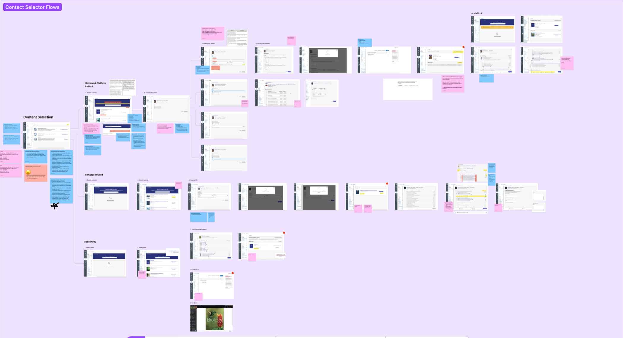
Full, detailed flow analysis for LMS course creation in FigJam
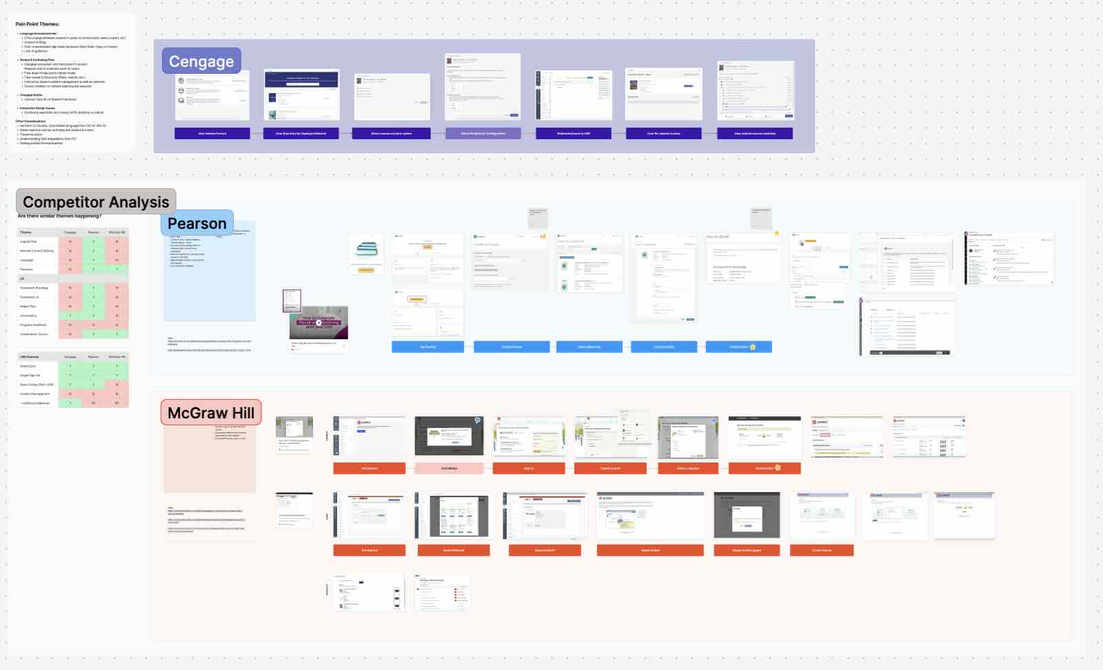
Detailed competitor analysis

Discovery Findings & Pain Point Themes
Langauge Inconsistencies:
- CTAs change between screens in action & context (add, select, import, etc)
- Context shifting
- Don’t communicate high stake decisions (Start Date, Copy vs Create)
- Lack of guidance
Broken & Confusing Flow
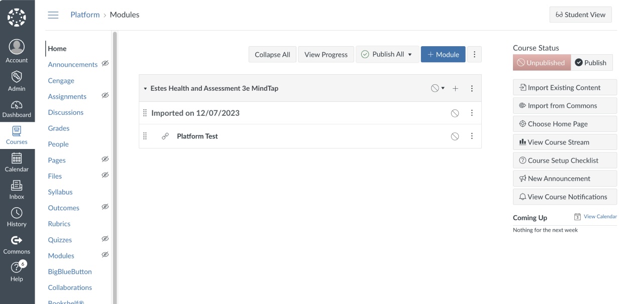
- Cengage ecosystem and data doesn’t always connect. Requires a lot of duplicate work for users
- Flow doesn’t map user’s mental model
- Flow routed in Discovery (filters, search, etc.)
- Instructors expect content management as well as selection
- Course creation vs content selecting are separate
Interaction Design Issues
- Confusing selections and context shifts (buttons vs radios)
Previous Experience
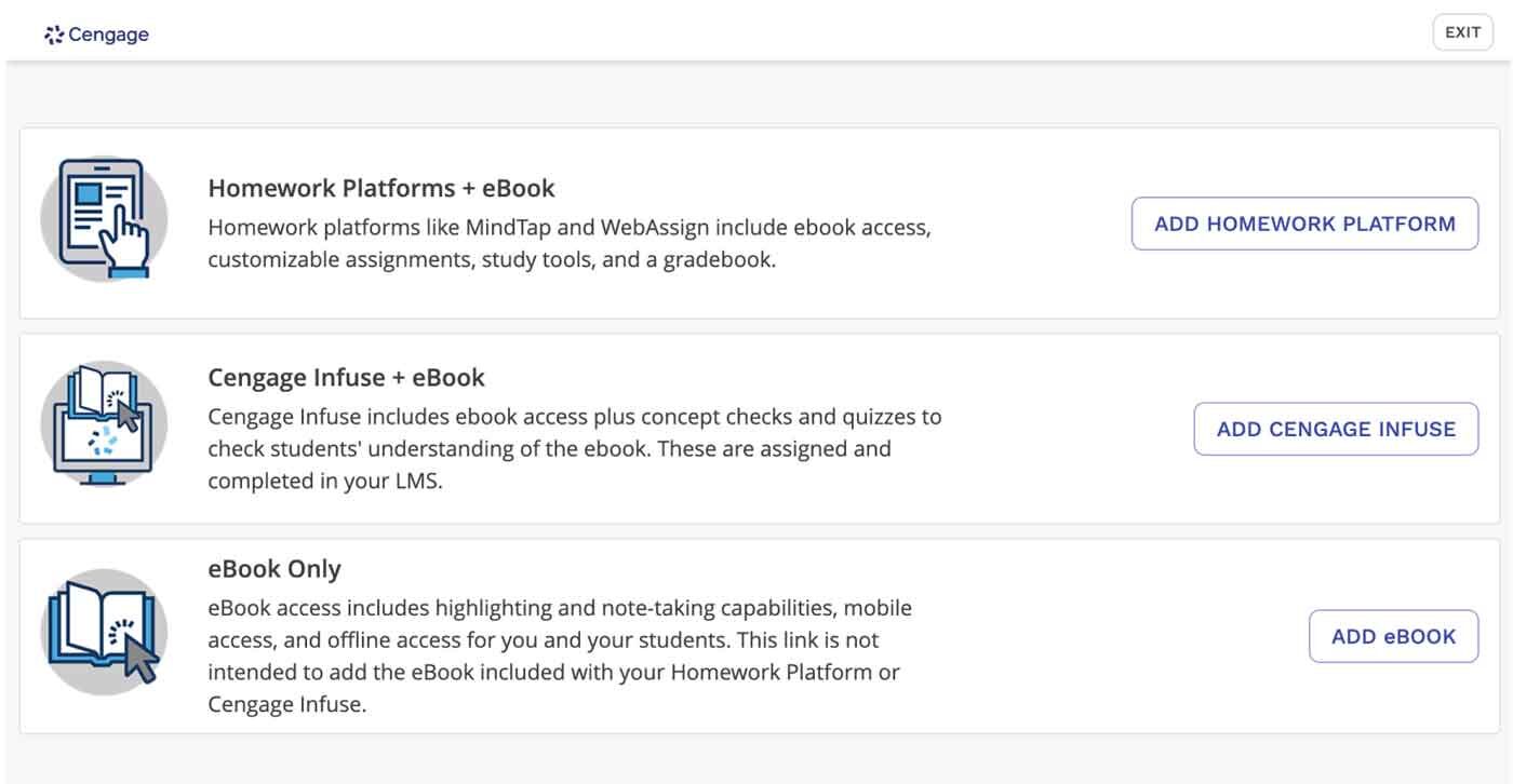
Usability Issues
1. User Selects Format
❌ No Context
Users don’t understand what they’re supposed to do at this step
❌ Unnecessary Information
Overexplains the options without guiding them won hat to do with this step or why it matters
❌ Mental Model
Feels like a decision they already made
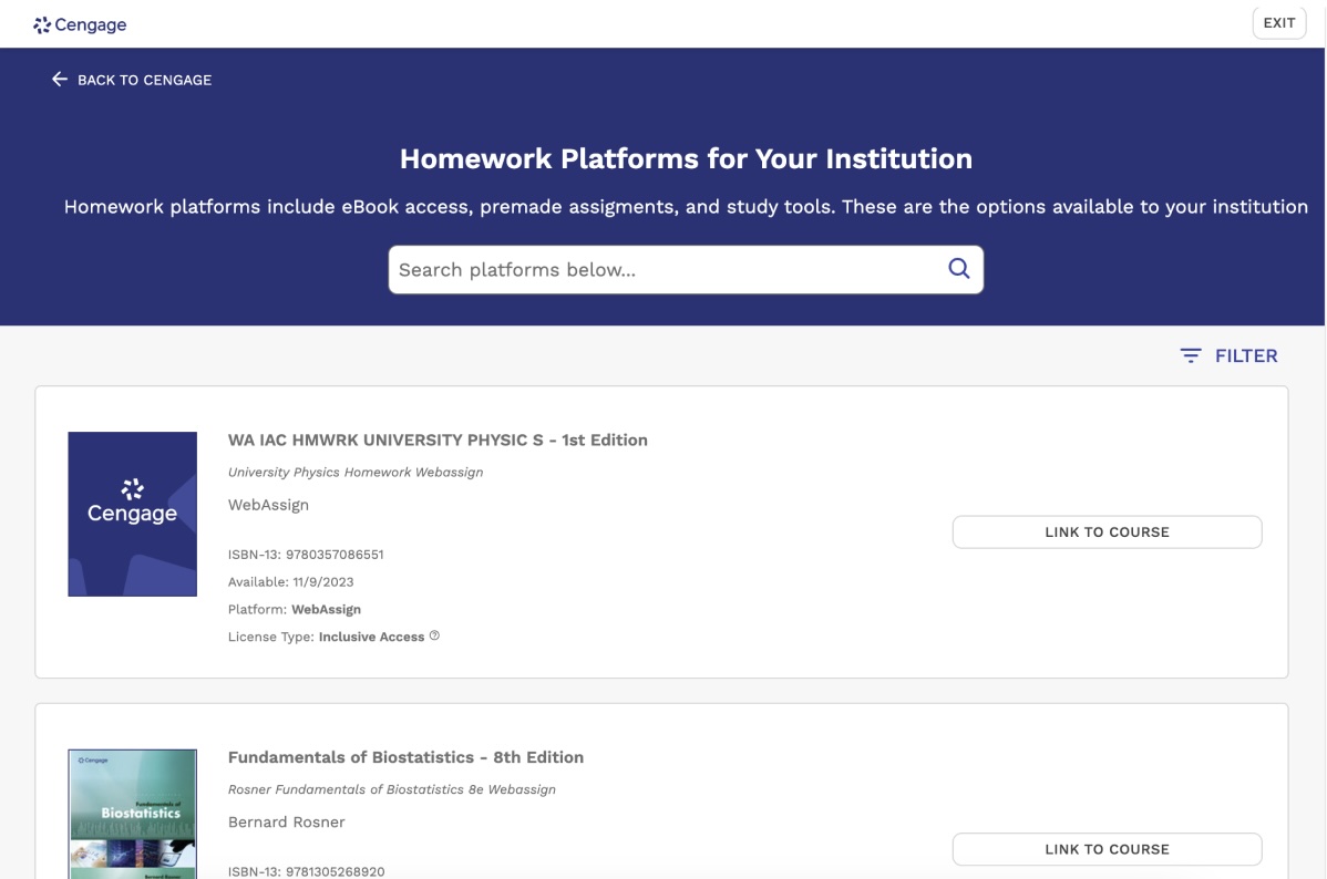
2. Searches for Deployed Materials
❌ Deployments Dependency
Users don’t understand that this is their Institution deployments and not just their materials. Instructors are confused and panic when their materials don’t appear in search results.
This also results in License Type confusion.
❌ Wrong Context (Search first approach)
Users are not looking to search or discover here, causing confusion as to what to do. Filtering is also lost and could minimize the need to search.
❌ Unnecessary Information
The information provided isn’t relevant to the user and references information for internal users and customer support.
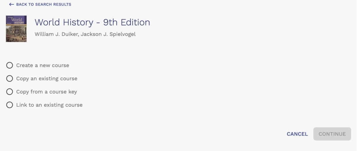
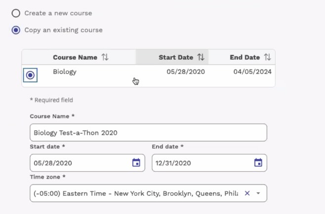
3. Select Course Creation Option
❌ No Context
Course type differences aren’t apparent
❌ Inconsistent UI
Context switching on how to select changes between screens (buttons vs radios)
❌ Nested Additional Steps
Several decisions are combined into one step.
4. Redirected Back to LMS
❌ No Confirmation
User is removed from the flow. Unless the user happened to ready the “Finish” button, they would have no idea that they have completed the course creation process.
📝 Low Fidelity
Explore Early Concepts, Information Architecture, and Experience Strategy
The new flow and redesign focuses on reducing redundancy, aligning terminology with instructor expectations, enabling more precise content management, and improving clarity throughout the process. It represents a shift from a disjointed, error-prone experience to one that is transparent, guided, and more in tune with how instructors actually approach course setup. The project’s primary goal was to create a seamless, intuitive user flow that allows instructors to connect Cengage content to their LMS independently. A secondary goal was to align the experiences across Cengage systems—specifically the Learning Platforms, the LMS, and the Cengage Instructor Center (CIC)—to provide a consistent and unified setup journey.
🎯 What We Aimed to Solve
Improve the LMS integration experience for our instructors
Lower customer support and rep calls that surround LMS integration needs when not necessary
Reduce the number of course severs due to user error
Ensure instructors feel confident about integrating LMS courses on their own.
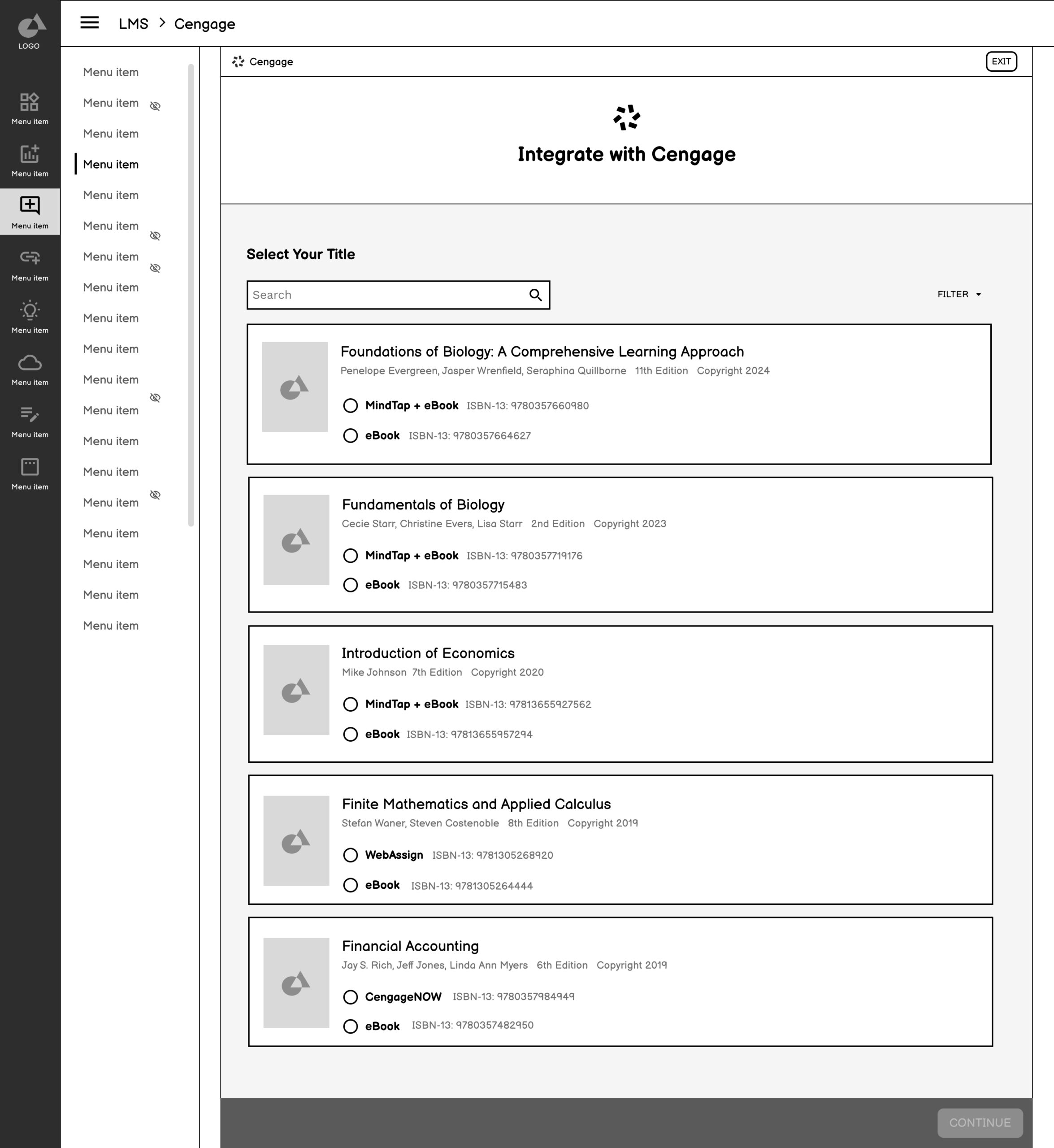
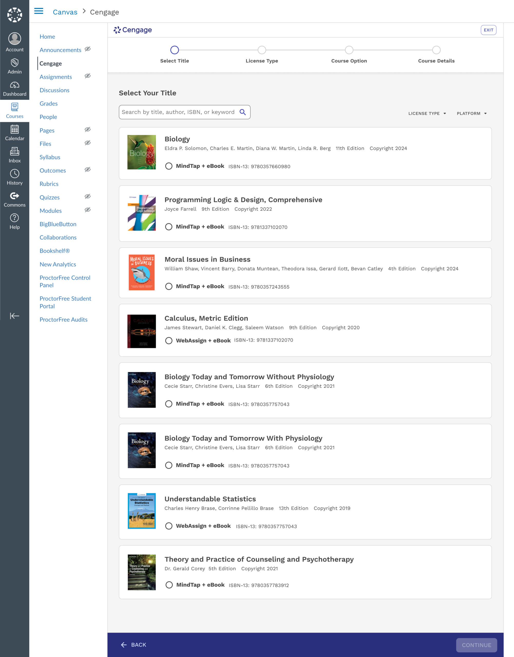
1. Select Your Title
✅ Reduces Complexity
This new launching step combines the format selection option, which often confuses users since it feels like they’re starting over.
Users will only see information that is crucial to them. Previously, there were several internal labels only meaningful to a customer support rep.
Users can call out immediately which option they need based on the option labels eBook or MindTap + eBook
✅ Matches Users Mental Model
Instead of introducing users to steps that feel repetitive, this landing page aims to reinforce and pick up where they left off.
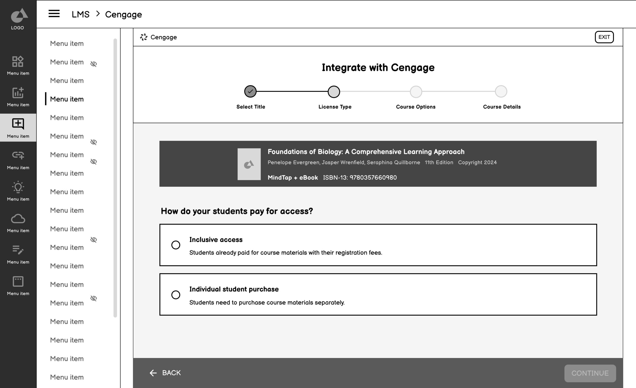
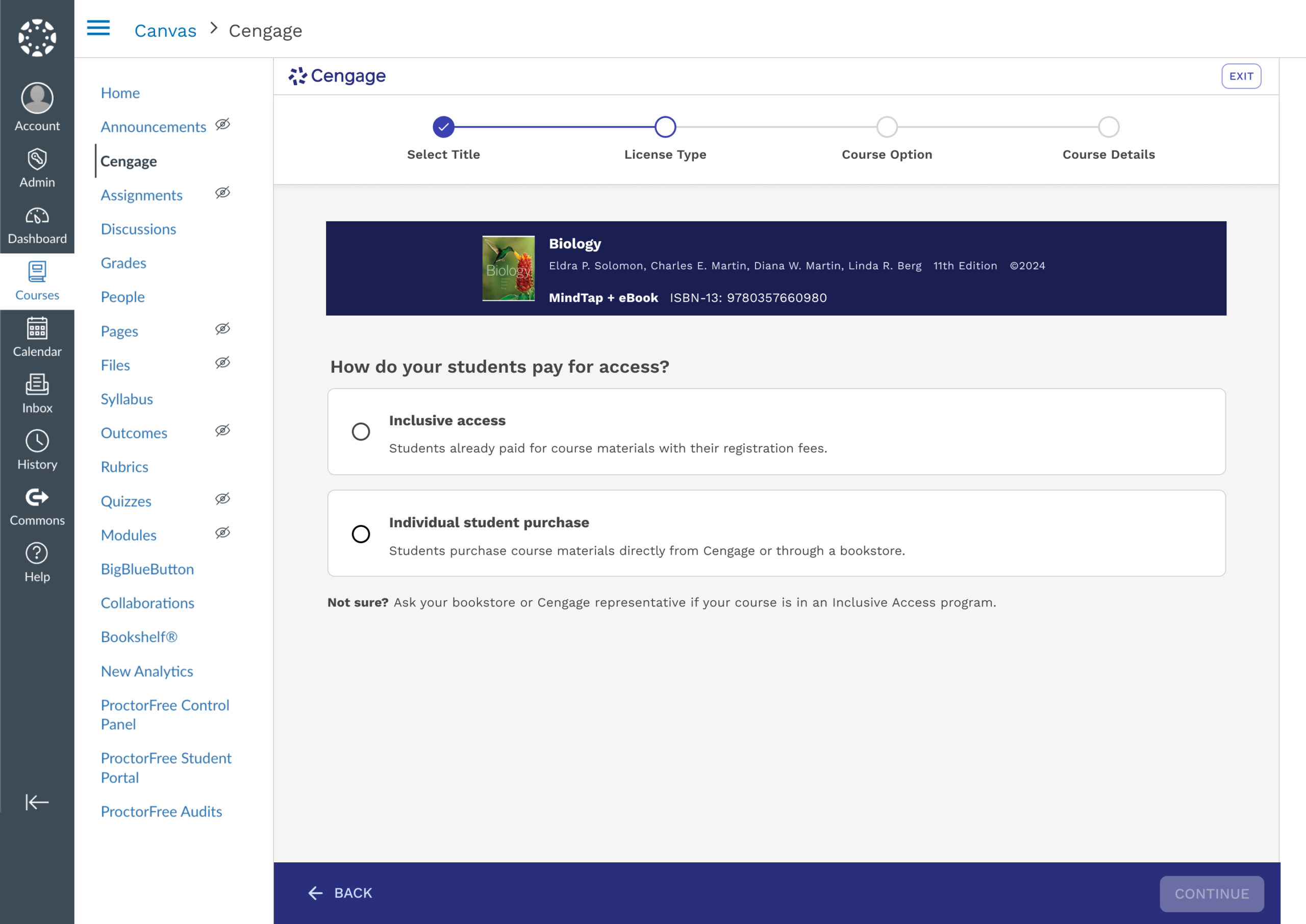
2. License Type
✅ Isolated, Detailed Step
A major point of friction, prone to error was selecting the correct license type. Previously, this step was nested under the search and select and was often missed.
✅ Builds confidence with visible progress and summary
Reinforces a sense of momentum and reduces anxiety by showing selection summary and progression.
✅ Prevents missed or skipped steps
Ensures all critical decisions (like license type) are surfaced clearly rather than buried in other screens.
✅ Supports self-service and reduces reliance on support
Makes the flow more intuitive and instructor-friendly
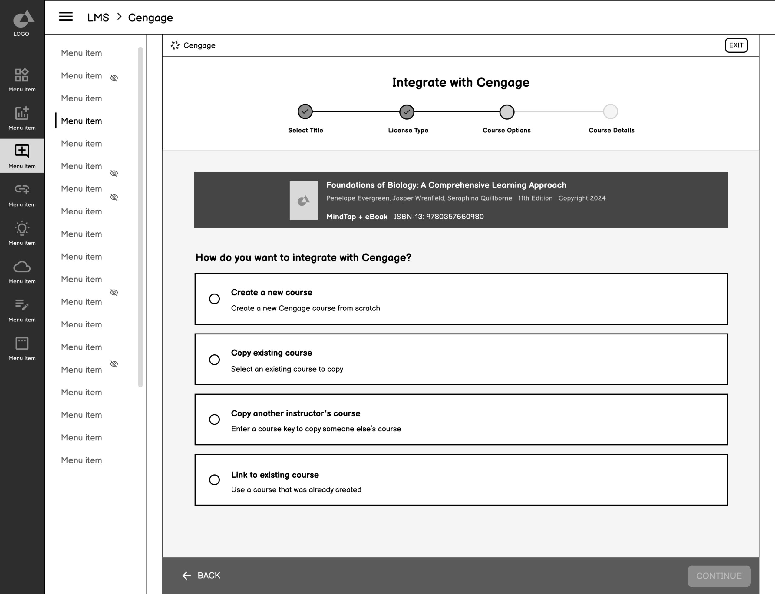
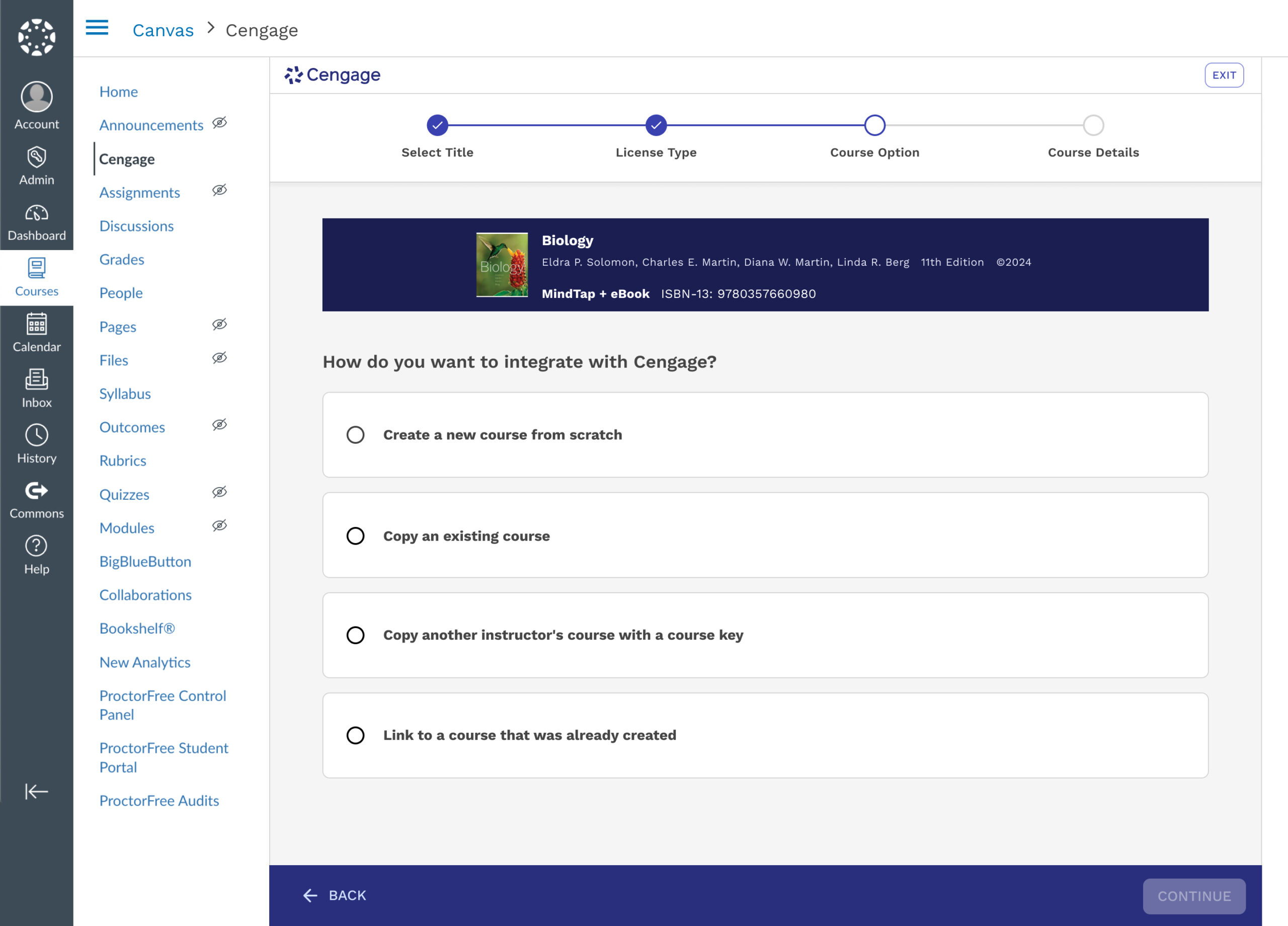
3. Course Option
✅ Option breakdown
Defines each option more accurately and removes ambiguity.
✅ Consistent UI patterns
Reinforces familiarity and reduces cognitive load by allowing users to focus on the decision—not on re-learning how to interact with each screen.
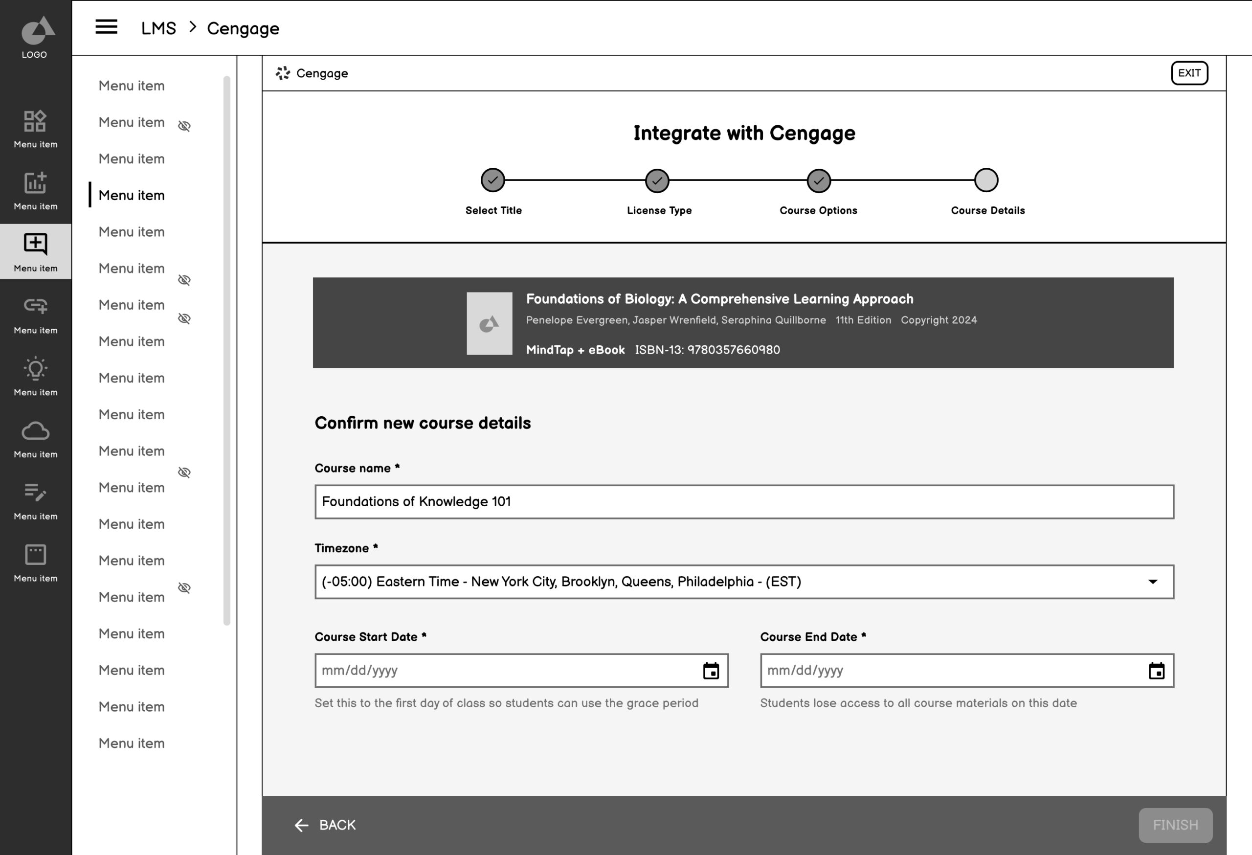
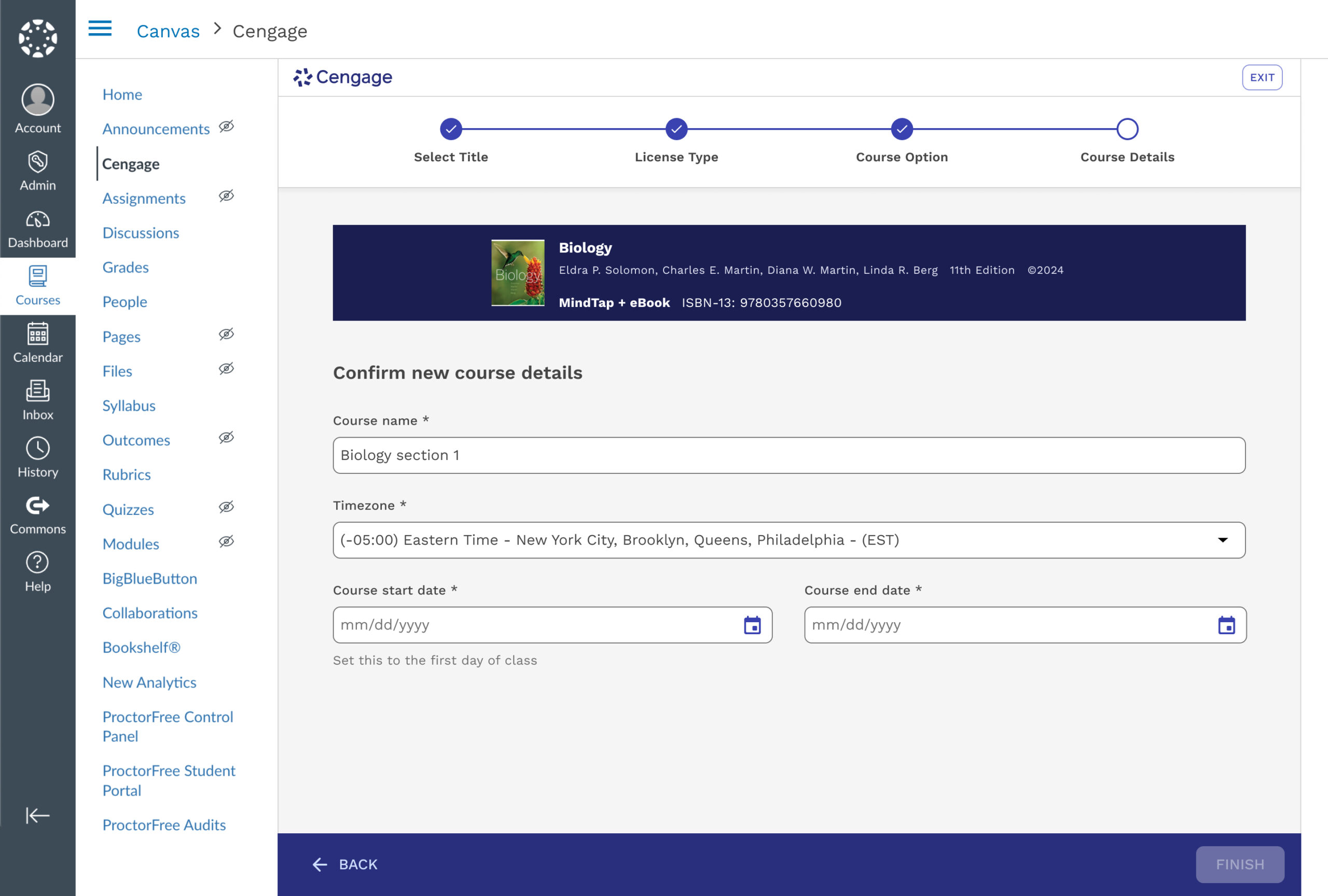
4. Course Details
✅ Simpler Decision step
Removed from being nested into multiple decisions points.
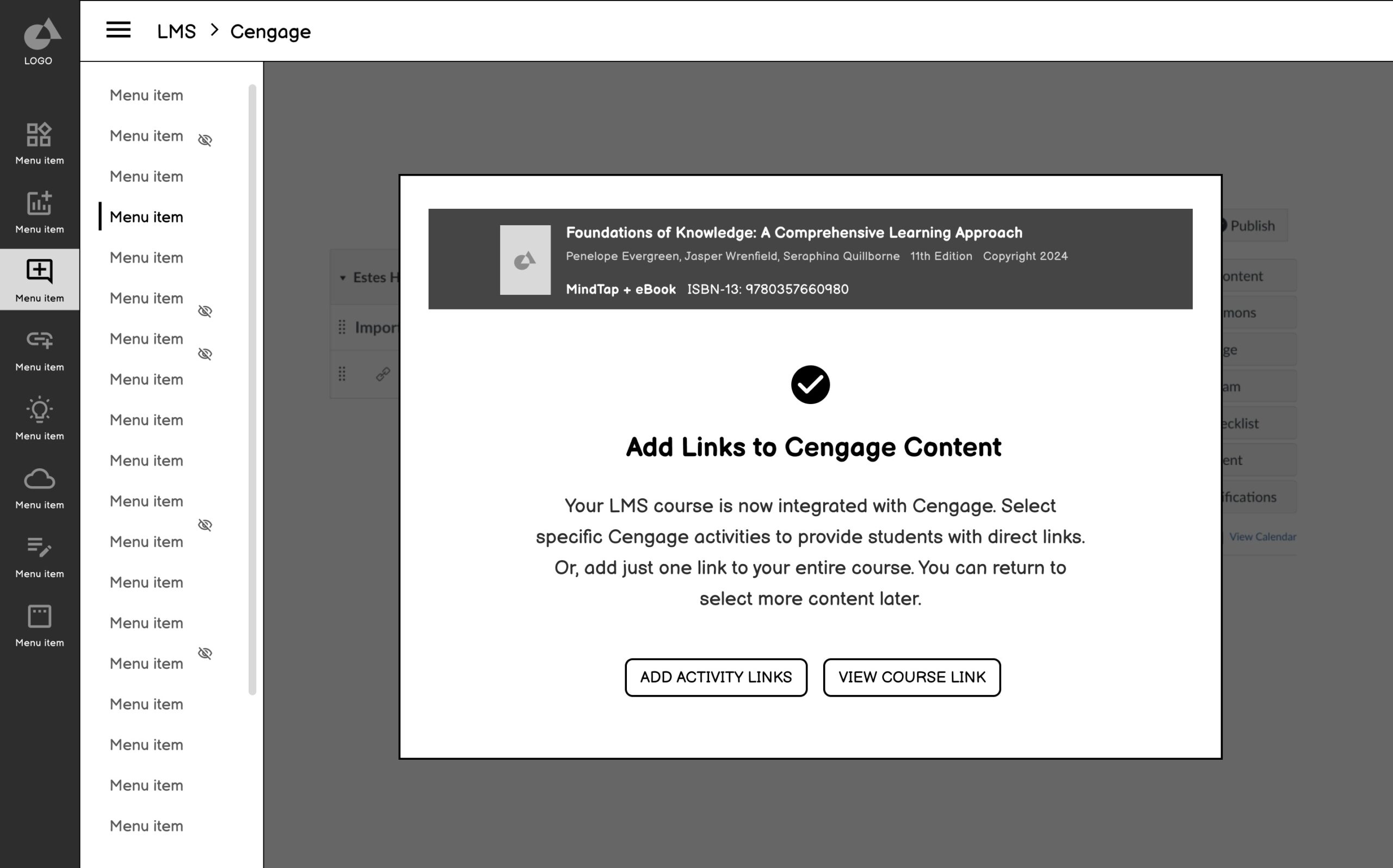
5. Confirmation
✅ Finalized Process
Inform users they are finished with the course creation process and give guidance on next steps.
📐 Research & Testing
Goals
Discover if users understand the process of the proposed LMS integration flow
Discover what confuses users in the flow and what helps them
Determine what questions instructors may still have about LMS integration
Determine what we can iterate on to test in hi-fi sessions
Methodology
30 minutes
Moderated Usability Sessions
14 Higher Education Instructors
Figma Prototype & Current State
📌 Key Findings
Simple and Familiar
The new flow tested was extremely successful. The order of the options were clear to instructors, and they vocalized how simple and familiar it was
Language is Everything
Because the flow is so simple, the language is what helps make sure instructors choose the right option for themselves. Iterative testing has helped us get closer to the most helpful language, but there is still room for improvement.
🖼️ High Fidelity
Refine Interaction Patterns, Validate Design Decisions, and Deliver Scalable UI
The high-fidelity designs translated our validated concepts into a polished UI that could be stress-tested for usability, clarity, and alignment with instructor expectations. These screens reflected a deeply considered UX strategy, incorporating feedback from usability testing, system stakeholders, and support teams. We introduced clearer labeling, progressive disclosure, and improved data visibility—reducing cognitive load and enabling self-service at key moments in the instructor journey.
⚖️ Considerations & Constraints
While refining the final UI, I had to balance clarity and control with system limitations and technical feasibility. For example, we simplified license type visibility to reduce user error, but needed to preserve backend logic that couldn’t be altered. Additionally, we retained the Selecting Formats page as the landing experience to align with development timelines. These tradeoffs ensured the final design was not only user-centered but also implementation-ready and scalable.
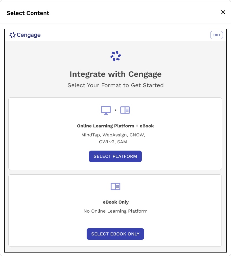
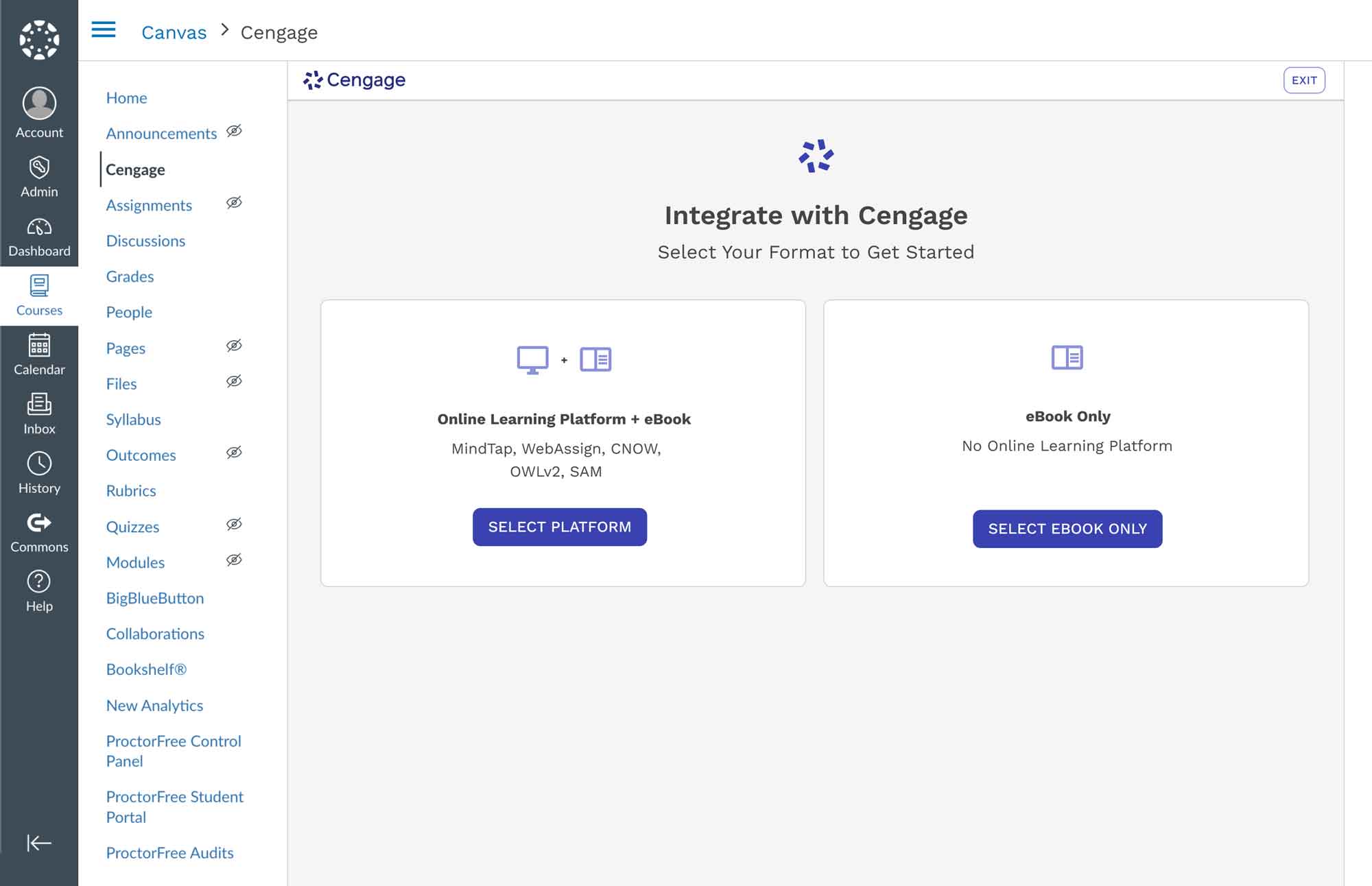
1. Select Format
Simplifies the experience further by grouping formats into two high-level paths, reducing cognitive load and guiding users into the correct flow more quickly.
⚖️ Technical Constraint
Needed to maintain formats first to maintain release timelines and thoughtful implementation
🏆 Win
Although format selection had to remain, we streamlined the experience into two high-level options. This reduced visual clutter, eliminated product jargon, and made the step faster and easier—especially for instructors encountering it for the first time.
2. Select Title
Simplifies the experience further by grouping formats into two high-level paths, reducing cognitive load and guiding users into the correct flow more quickly.
3. Select License Type
Helps instructors indicate whether students access materials through Inclusive Access or individual purchase, with guidance for those unsure of their model.
⚖️ Technical Constraint
Although this step was a common friction point, it remained essential to the intake process and could not be removed.
🏆 Win
We refined the language and added contextual support, which significantly reduced confusion and helped instructors complete the step with more confidence.
4. Select Course Option
Simplified complex options into clear, selectable paths to course creation.
5. Confirm Course Details
Confirm key course details before finalizing integration. It ensures accurate setup for syncing Cengage content with the LMS and makes sure the student grace period is accurately provided.
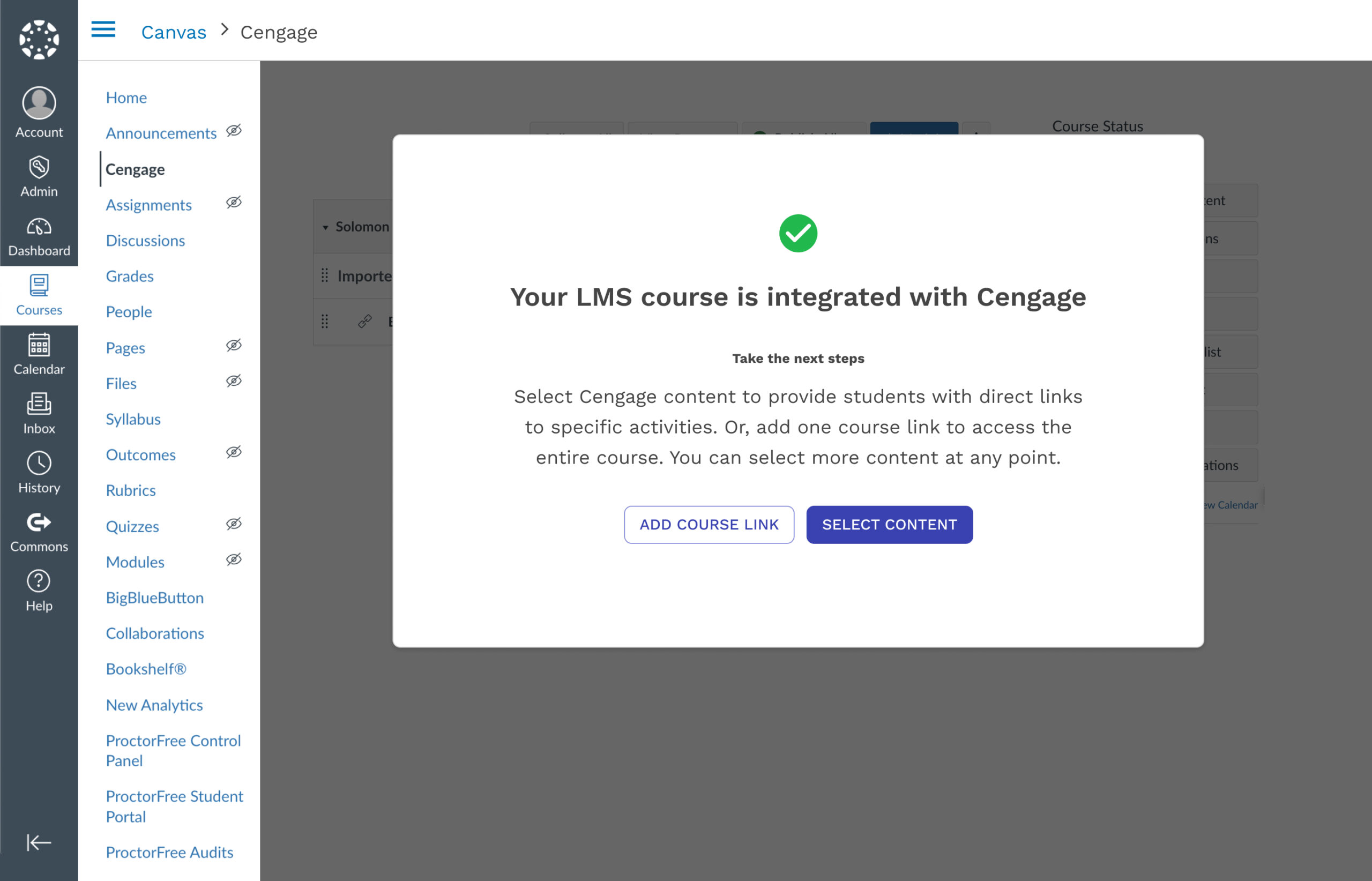
6. Confirmation
Notifies instructors that LMS integration is complete and offers clear next steps to begin linking Cengage content. It supports immediate action by presenting the most common tasks post course creation.
♿ Accessibility Improvements
To improve inclusivity and reduce barriers for all instructors, we implemented a broad set of accessibility enhancements across the LMS integration flow. These updates were designed to align with WCAG standards while improving the overall usability and clarity of the experience for all users:
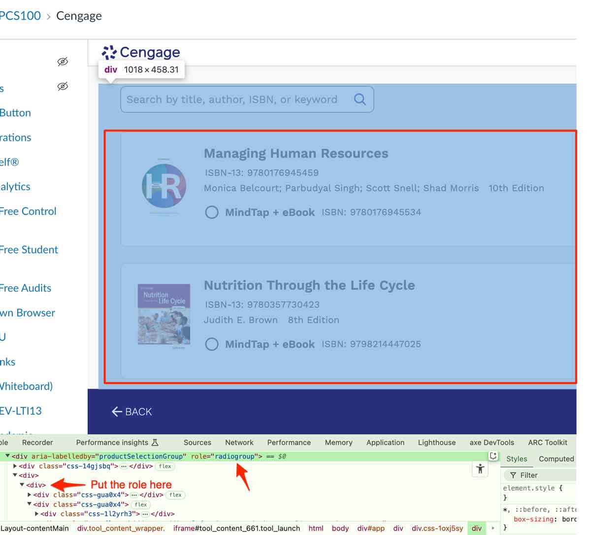
Inappropriate ARIA role used
WCAG SC 4.1.2 Name, Role, Value (A)
-
Increased contrast and improved text hierarchy for better legibility
-
Clear, persistent form labels and helpful error feedback
-
Enhanced screen reader compatibility through semantic structure and ARIA attributes
-
Simplified content and decision points to reduce cognitive load
-
Full keyboard navigation support throughout the flow
These enhancements helped align the flow with WCAG accessibility standards while improving usability for all instructors, including those using assistive technologies.
🗂️ Summary Overview
At the start of every semester, instructors are tasked with connecting their digital course materials to a Learning Management System (LMS)—a process that’s often riddled with confusion, duplicated steps, and a high dependency on support. Through this project, I led a comprehensive redesign of Cengage’s LMS Content Selector experience to address these pain points at both the user and system levels. The existing flow placed unnecessary cognitive burden on instructors, lacked clarity at key decision points, and fragmented the experience across the LMS, CIC, and content platforms.
I partnered across product, engineering, research, and support teams to map the current-state journey, identify usability breakdowns, and validate proposed improvements through internal research, user interviews, and a focused UX sprint. The resulting solution emphasizes clarity, data transparency, and system continuity—enabling instructors to confidently integrate their Cengage content with minimal friction or support. From low-fidelity ideation to high-fidelity handoff, this work reflects a balance of problem-solving, business alignment, and strategic UX leadership. The final design delivers a more intuitive, self-serve experience while reducing operational strain and aligning with the long-term goals of the platform ecosystem.
