Overview
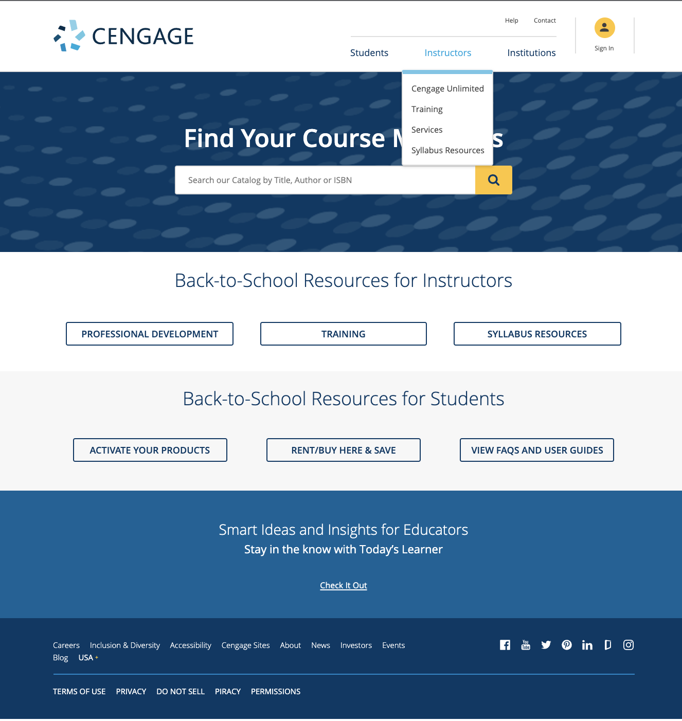
The Cengage Instructor Website project focused on improving the faculty experience during product discovery, onboarding, and adoption via cengage.com. Our goal was to streamline catalog browsing, sign-in, and global navigation—reducing friction and aligning with user behaviors uncovered in UX research.
🎯 Tasks & Goals
Create an easier path for discovery and adoption for new and existing Instructors. Simplify the search and sign-in experience, including developing a streamlined navigation menu to minimize task distractions.
🎨 Design Deliverables
Component redesigns
Navigation menu revamp
Updated visual design & component specs
Responsive UI mockups
🤝 Stakeholders & Collaborators
Web Development Team
UX Researcher
Product Manager
Branding Design Team
📊 Key Takeaways & Results
Increased task completion speed in usability testing
Reduced friction in navigation and search
Clearer CTA hierarchy improved wayfinding
📋 Component Designs & Specifications
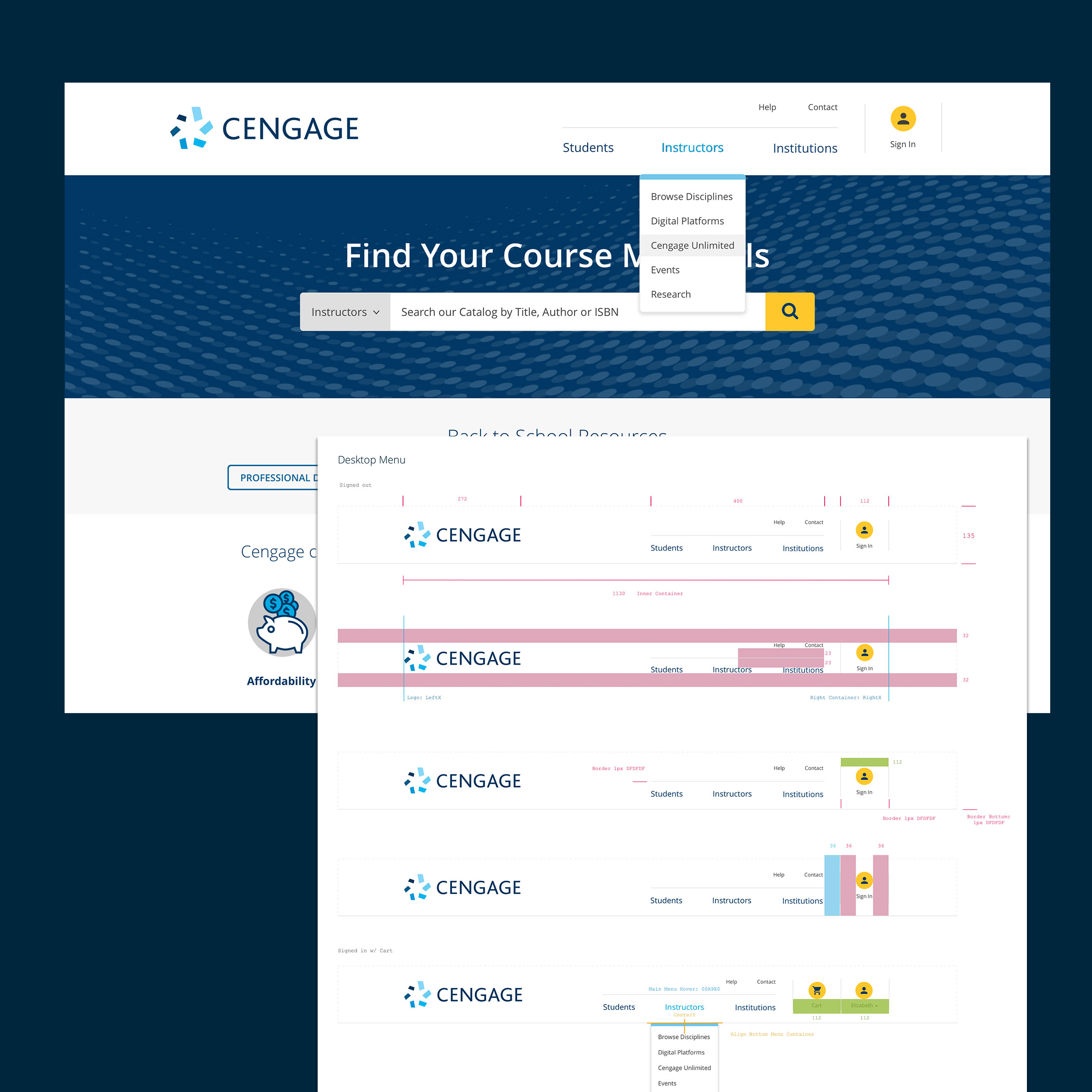
To improve clarity, accessibility, and ease of use, I redesigned key navigation and search components with updated visual hierarchy and spacing rules. These components were optimized across multiple breakpoints to ensure full responsiveness, from desktop to mobile.
Design specs addressed font sizing, color contrast, alignment, padding, and tap targets. Particular focus was placed on search behavior across viewports, including:
-
Large Banner Components (desktop/tablet): Emphasized a clear call to action, simplified filters, and adjusted element spacing for visual clarity.
-
Small Banner Variants (mobile): Refined for smaller screens with expanded tap zones and dropdown behavior. On interaction, the search field expanded full-width to prioritize usability.
-
Dropdowns and Cart Flyouts: Designed flexible containers with scalable typography and spacing based on longest content items; ensured styling met accessibility and brand guidelines.
-
Color & Typography Systems: Defined tokens for consistency and paired each component with redlined developer specs for accurate handoff.
These updates were tested in usability sessions and validated through cross-functional QA with engineers and researchers to ensure smooth implementation across screen sizes.

Large Banner Component
Color & Typography System

Dropdown Menus & Cart

Small Search Banner Component
Previous Design

New Design


